COLLECTABLE GINGER BEER VARIANTS
Incised Ginger Beer Variations
Incised ginger beers are an interesting area for discussion. Only serious collectors seem to be drawn to these bottles. I guess this is because they are normally monochrome (either white or any shade of brown) and are clearly not as pretty as the transfer print variations that are around. Also, the writing on them is much less readable than the contrast achieved with transfer prints. This all makes them less pretty as display bottles but do provide an additional part of the history of the brewers using (and companies making) these bottles.
The process involved appears to be that of actually impressing or incising individual letters into the wet clay of the bottle before firing. As a result the letters do not always form straight lines when you look at the words impressed. The simple task would have been done by low paid workers who probably could not spell or read, or were at least very poorly educated. They would have almost certainly followed a template of letters (a picture if you will) of what the final lettering should look like. They were also probably paid piecemeal and therefore would have tried to incise each ginger beer bottle quickly. As a result of these things, the variations on the writing for incised ginger beers varies widely.
As a collector I have always found it difficult to establish whether these variations actually relate to recordable variations. Of course, as with any serious collector, it does not stop me collecting these differences....I suppose more as a curiosity than anything else.
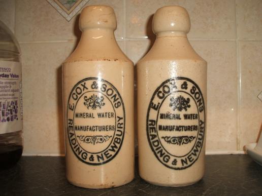
A brilliant example of this is as below. The photos have been sent to me courtesy of Les Hawkins. As I collect Berkshire ginger beers the examples I use are from Berkshire of course but I am certain that similar variations must have happened across the country.
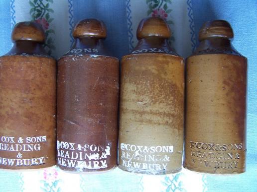
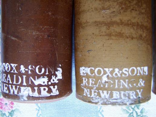
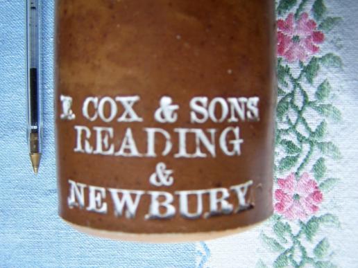
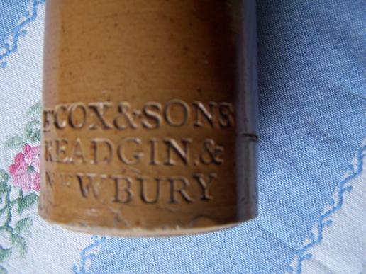
These bottles are all cork closure and all have "COX & SONS" incised on the shoulder. They are also all salt glazed with varying degrees of success and therefore varying colour. On the main body they all have the following incised "E. COX & SONS, READING & NEWBURY". They also all have no bottle makers mark and were probably therefore all made by the same maker. The incising has been 'chalked' so that it shows up better.
In the first photo, bottles 3 and 4 (from left to right) appear very similar except the 4th one spells "READING" as "READGIN" on the main body. To me this is not really a variation but an error by the person who is doing the incising work.
The type face on bottles 1 and 2 seem similar, the layout of the type face is different, bottle 1 having the "&" on a separate line. This was probably a conscious decision to change the layout (template) of the writing. It is difficult to tell whether this would have been a request from the brewers or a decision by the bottle maker.
Bottle 2 and 3 appear to have very slightly different type faces as the type face on bottle 2 appears slightly bigger. Whether or not this could be achieved through a difference in the striking process of incising is difficult to say. Even a slight angle change could produce this. Of course it could also be produced by a different set of incising letters. These may have been used by a different incising person on the same site or perhaps because a set had worn out. To me this is not a deliberate change in any way or form.
Currently these are not included as separate variations in my list of known ginger beers, but of course this is open to everyone's own opinion. If any of them constitute a variation then it is probably the first one as it probably amounts to a deliberate layout change.
Many thanks to Les Hawkins for pointing this one out to me and the brilliant photos for comparison.
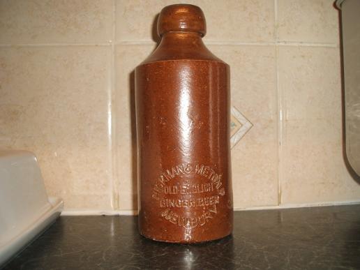
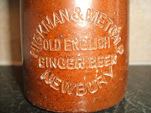
Better examples of the writing on incised ginger beers also exist. These would have been typeset into plates to form a one-time impression into the wet clay for individual words. Probably the most common of all incised ginger beers was by individual words at a time. Obviously this process was quicker than forming individual letters and batches of bottles could be incised quickly.
Quicker still would have been where a whole plate of words were formed to make all the incisions in one go. As such it was more likely to be thoroughly checked before a batch was started which is presumably why we tend to find less examples of errors on these bottles. The Hickman & Metcalf ginger beer bottle below is an example of this.
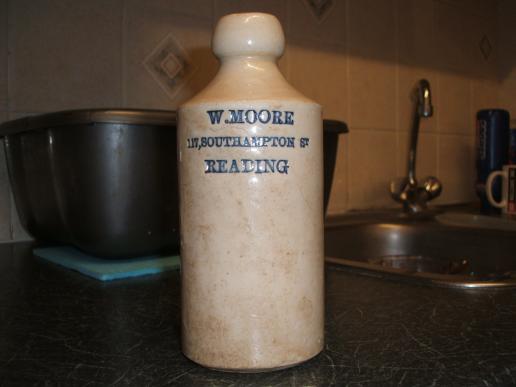
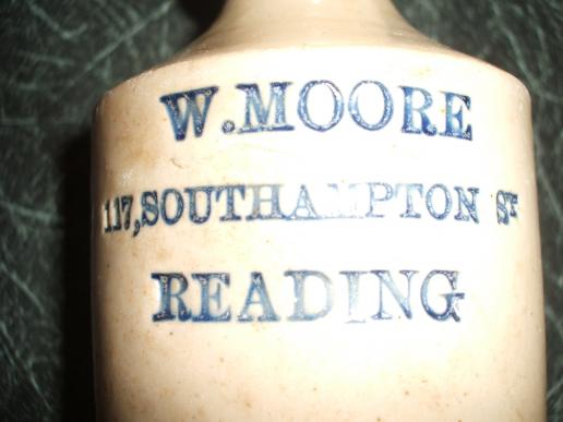
A more unusual variant to this is demonstrated well with the W. Moore bottles from Reading. The bottle formed has a white glaze. The words formed as an impression into the wet clay and glaze however are cobalt blue. So in some way or form a viscous cobalt glaze must have been painted onto the words on the incising plates before impression into the clay. It had to be a thick glaze otherwise it would have run down the bottle before firing.
Looking carefully this can be seen in the picture below. The flash on the camera demonstrates that the blue colour is in fact part of the glaze. Looking more carefully still there appears to be white glaze below the blue glazed letters.
What constitutes a different variation of incised/impressed ginger beer?
It is quite difficult to assess what constitutes a true variation to incised ginger beer bottles. My opinion (for what it is worth) is as follows:
1) If two bottles are the same but one is internal screw closure and one is cork closure then these are 2 different bottles and are therefore variants even if they have the same incised writing. Any variation in closure has to constitute a separate collectable variant.
2) A clear difference in colour e.g. white compared to brown (but not variations in colour due to the success of firing in a kiln as with salt glazes) constitute a variation.
3) Different bottle makers but with the same incising. If two bottle makers marks are different then this must constitute a variation even to the extent I feel where it is the same bottle maker who had adopted a different maker mark at a different point in time.
4) A conscious change in the wording or template probably also suggests a variation. Ginger beer bottles were normally ordered by the gross (i.e. 144 at a time). I think a conscious change probably amounts to a whole order of 144 that are different.
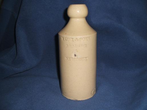
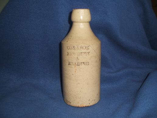
The pictures below are also of Cox bottles. These are obviously a different colour to Les's photos above. Also the one on the right is made by "BAILEY FULHAM", when they used their rectangular shape makers mark. The one on the left is "BAILEY & CO. FULHAM" but in a circle. This alone would constitue 2 variations of bottles. It is made clearer though by the fact that the one on the left is "E. Cox & Sons" as opposed to "Cox & Sons" and is "Reading & Newbury" as opposed to "Newbury & Reading". The second photo is clearly one of a much earlier ginger beer than the first.
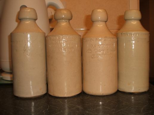
Perhaps the hardest of the variations to assess are those of different type faces. I am not sure I can form an opinion in some cases and it may be that this is down to individuals. A Berkshire example of this is with W. Thorp of Reading. Below are 4 different incised ginger beers with different type faces. There are many other W. Thorp variations on this theme too. Fortunately some of the variations have different bottle makers.....that does makes it easier. The bottles also often have slightly different shapes too and some don't have bottle makers marks at all. It is quite a tricky one in my opinion.
Transfer Printed Ginger Beer Variations
Interestingly with transfer printed ginger beers it all seems much simpler. In my mind any transfer differences at all (even the tiniest change which is not as a result of putting the transfer on) constitute a different variation purely because someone had to physically make the decision to change the transfer print.
Also you do find that different bottle makers tried to exactly copy prior transfer prints from earlier bottle makers. This was presumably because brewers went to different bottle makers (perhaps because of price) but wanted the same transfer print on their bottle. Even then there do tend to be very slight differences in the transfer print.
Below is an example of a PRICE BRISTOL maker on the left and POWELL BRISTOL maker on the right. Similar aren't they.....just very slightly different size and the star is more of a flower on the other.
Using E. Cox as an example again. The version on the left is PRICE BRISTOL and the version on the right is PRICE POWELL BRISTOL. The print on the left is 78mm tall and the one on the right is 84mm tall. In fact when you feel the bottles the glazes are totally different, the left one being really smooth and the right one extremely bumpy to the feel.
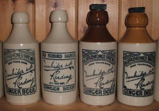
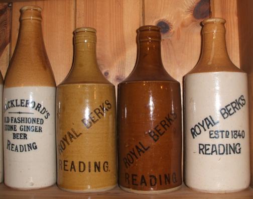
This brings me nicely onto glaze differences. Moreover differences in colour glazes. The way that I look at this aspect is that when I am at a bottle show and I see a bottle that I have but the colour looks very different then it is a variant. If I would have to take the bottle home and compare it to the one I have already then it is almost certainly not a variant in colour. All glazes formed in different batches could vary very slightly but substantial colour differences would have been deliberate. A good example of this is with the Tunbridge & Co. ginger beers from Reading pictured below. If you click on the first picture then the two furthest right ones in the picture are clearly variants and is something that you would notice at a show if you had one and were lucky enough to find the other. Similarly in the second picture the two central Royal Berks Reading ginger beers would also be recognisable as different ginger beers without comparison.
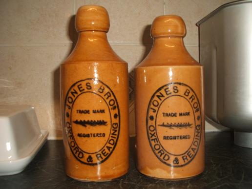
I guess the last two things to think about are shape variations and size. To be fair, from Berkshire there are very few ginger beers made which weren't a half pint measure. Obviously any bottle that is not this size is a collectable variant. Perhaps one grey area is with the Jones Bros. Oxford & Reading Ginger Beers pictured below. These two are both POWELL BRISTOL bottle makers with identical transfers but the shape of the bottle is very different the one on the right being much dumpier. In my opinion these are two collectable variants.
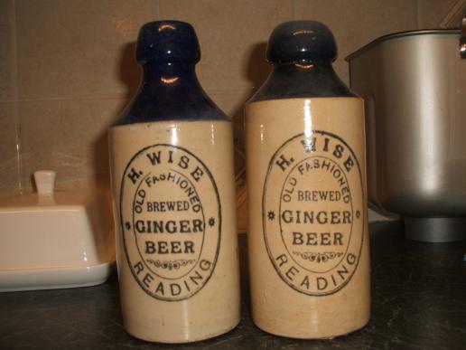
With regard to shape, one particular difference in ginger beers appears to be the length of the neck. The longer stretched neck variaties I feel are different to the more dumpy necks. See the H. Wise example below. Again, the transfers are identical and the bottle makers are the same being BOURNE DENBY in this example. In actual fact there is a difference in the colour blue that was formed on all of these bottles the right example being much duller and less vivid. This is perhaps a bit difficult to see in this picture (...and yes they were both a bit dusty!)
Anyway, hopefully this page has provoked some thoughts with you all even if you disagree with my analysis.